
Jorge Chércoles, May 14, 2024
When it comes to authoring content in a CMS, a clear but flexible UI is key for a good authoring experience. AEM only provides a single mechanism to show or hide dialog fields by default, based on user’s selection, using a select field (granite/ui/components/coral/foundation/form/select) as the trigger.
In more than one situation, we found that this wasn't enough for authors and created a custom solution to provide a simple way to extend this feature to almost any type of field. I'll walk through what we did below. One thing of note is that the target element could be almost anything, and, it also works in multifields!
Use Cases
The following are examples, each with its specific XML configuration and a video showing how it works.
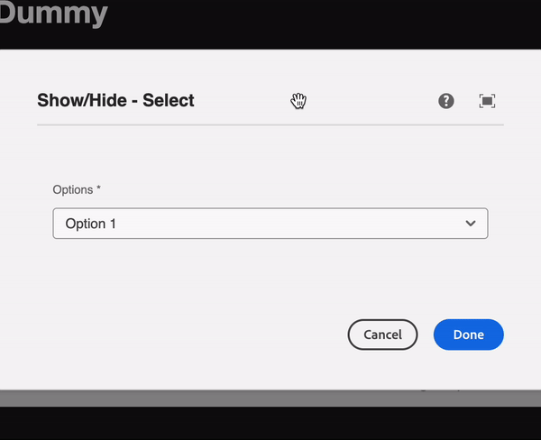
Show/Hide based on a select
Using a <select> and targeting a container.
+ select
- sling:resourceType="granite/ui/components/coral/foundation/form/select"
- granite:class="cq-dialog-showhide"
+ granite:data
- cq-dialog-showhide-target=".select-showhide-target"
+ items
+ item-1
- text="Item 1"
- name="item-1"
+ item-2
- text="Item 2"
- name="item-2"
...
+ container
- sling:resourceType="granite/ui/components/coral/foundation/container"
- granite:class="hide select-showhide-target"
+ granite:data
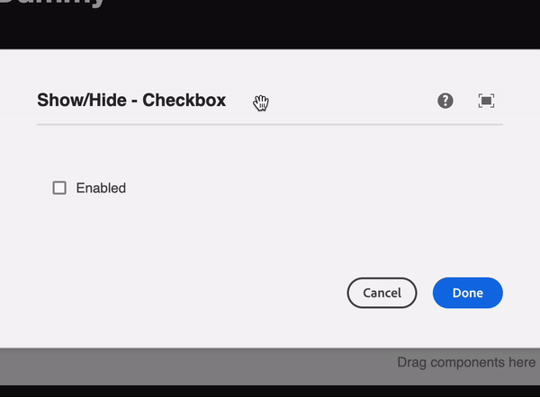
- showhidetargetvalue="item-2"Show/Hide based on a checkbox
Using the same markup, we can use a <input type="checkbox"> as the trigger, instead of a <select>.
We can then use true or false as the possible values to show/hide.
+ checkbox
- sling:resourceType="granite/ui/components/coral/foundation/form/checkbox"
- granite:class="cq-dialog-showhide"
+ granite:data
- cq-dialog-showhide-target=".checkbox-showhide-target"
+ container
- sling:resourceType="granite/ui/components/coral/foundation/container"
- granite:class="hide checkbox-showhide-target"
+ granite:data
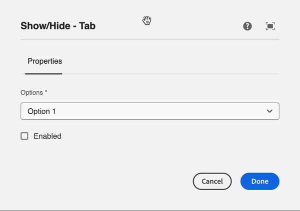
- showhidetargetvalue="true"Using a Coral-tab as the target
If needed, we can target a <coral-tab>. We can use either a <select> or a <input type="checkbox">.
+ tabs
  - sling:resourceType="granite/ui/components/coral/foundation/tabs"
  + items
    + tab-1
      ...
      + select
        - sling:resourceType="granite/ui/components/coral/foundation/form/select"
        - granite:class="cq-dialog-showhide"
        + granite:data
          - cq-dialog-showhide-target=".select-showhide-target"
        + items
          + item-1
            - text="Item 1"
            - name="item-1"
          + item-2
            - text="Item 2"
            - name="item-2"
          ...
      + checkbox
        - sling:resourceType="granite/ui/components/coral/foundation/form/checkbox"
        - granite:class="cq-dialog-showhide"
        + granite:data
          - cq-dialog-showhide-target=".checkbox-showhide-target"

    + tab-2
      - sling:resourceType="granite/ui/components/coral/foundation/container"
      - granite:class="hide select-showhide-target"
      + granite:data
        - showhidetargetvalue="item-2"
        + items
          ...

    + tab-3
      - sling:resourceType="granite/ui/components/coral/foundation/container"
      - granite:class="hide checkbox-showhide-target"
      + granite:data
        - showhidetargetvalue="true"
        + items
          ...
Working with multifields
When we want to show/hide elements within a <multifield>, there are two use cases:
- Trigger is outside of the multifield
This case will show/hide the elements inside every element of the<multifield>, and new elements will be created showing/hiding it based on the value. - Trigger is inside of multifield item
This case will only show/hide the elements of the current item being modified.

+ checkbox
  - sling:resourceType="granite/ui/components/coral/foundation/form/checkbox"
  - granite:class="cq-dialog-showhide"
  + granite:data
    - cq-dialog-showhide-target=".multifield-showhide-target"

+ multifield
  - sling:resourceType="granite/ui/components/coral/foundation/container"
  + items
    + fieldset
      - sling:resourceType="granite/ui/components/coral/foundation/form/fieldset"
      + items
        ...
        + checkbox
          - sling:resourceType="granite/ui/components/coral/foundation/form/checkbox"
          - granite:class="cq-dialog-showhide"
          + granite:data
            - cq-dialog-showhide-target=".checkbox-showhide-target"

        + container // this container is handled inside the multifield item
          - sling:resourceType="granite/ui/components/coral/foundation/container"
          - granite:class="hide checkbox-showhide-target"
          + granite:data
            - showhidetargetvalue="true"
            + items
              ...

        + container // this container is handled outside the multifield item
          - sling:resourceType="granite/ui/components/coral/foundation/container"
          - granite:class="hide multifield-showhide-target"
          + granite:data
            - showhidetargetvalue="true"
            + items
              ...
Other use cases
Given the generalization of the script, you can also use <input type="text"> and match the text value to show/hide a container.

Below you can find the JavaScript snippet that you can use to you can create a custom clientlib and use the OOTB category for the dialog (cq.authoring.dialog) or create your custom one and embed it using either extraClientlibs or IncludeClientlibs.
Note: This solution is developed using Coral inputs Granite UI Foundation Server-side — Granite UI 1.0 documentation. If the trigger (<input>) is not coral, this feature won't work.
(function (document, $) {
    'use strict';
    // When dialog gets injected
    $(document).on('foundation-contentloaded', function () {
        $('.cq-dialog-showhide').each(function () {
            showhideHandler(this);
        });
    });
    // When input changes
    $(document).on('change', ':not(input[type=text]).cq-dialog-showhide', function () {
        showhideHandler(this);
    });
    // When textfield changes
    $(document).on('input', 'input[type=text].cq-dialog-showhide', function () {
        showhideHandler(this);
    });

    function showhideHandler(input) {
        // Targets that will be shown/hidden
        var target = $(input).data('cqDialogShowhideTarget');
        // Current selected value
        var value = $(input).val();
        if ($(input).is('coral-checkbox')) value = (!!input.checked).toString();

        $(target).each((_, elem) => {
            // If data-showhidetargetvalue is different from the selected value
            // Element should be hidden
            var isHidden = $(elem).attr('data-showhidetargetvalue') !== value;
            $(elem).toggleClass('hide', isHidden);
            // If target is a coral-tab
            if ($(elem).parent().parent().is('coral-panel')) {
                // Show/Hide tab label
                var tabIndex = $(elem).closest('coral-panel').index();
                $(elem)
                    .closest('coral-tabview')
                    .find('coral-tablist>coral-tab:nth-child(' + (tabIndex + 1) + ')')
                    .toggleClass('hide', isHidden);

                // Adjust Tab underline position
                // This behaviour can be seen when opening dialog in full-width
                var tab = $(elem).closest('coral-tabview').find('coral-tablist>coral-tab[aria-selected="true"]');
                var line = $(elem).closest('coral-tabview').find('coral-tablist>div[handle="line"]');
                var width = tab.width();
                var position = tab.position().left + parseInt(tab.css('marginLeft').replace('px', ''));
                line.css('transform', 'translate(' + Math.round(position) + 'px, 0px)');
                line.css('width', Math.round(width) + 'px');
            }
            // If element is hidden, remove all required inputs
            // To track which inputs were required, we store that info in the data-required/data-aria-required
            if (isHidden) {
                $(elem).find('[required]').attr('data-required', 'true').removeAttr('required')
                $(elem).find('[aria-required]').attr('data-aria-required', 'true').removeAttr('aria-required');
            }
            else {
                $(elem).find('[data-required]').attr('required', 'true').removeAttr('data-required');
                $(elem).find('[data-aria-required]').attr('aria-required', 'true').removeAttr('data-aria-required');
            }
        });
    }
})(document, Granite.$);
If you want to see this working, you can download an example project from 3|SHARE's public repository:
- Clientlib definition: https://bitbucket.org/3SHARE/aem-show-hide-dialog-fields/src/main/ui.apps/src/main/content/jcr_root/apps/dummy/clientlibs/clientlib-authoring/
- Working examples: https://bitbucket.org/3SHARE/aem-show-hide-dialog-fields/src/main/ui.apps/src/main/content/jcr_root/apps/dummy/components/showhide/
Get in touch
At 3|SHARE, when it doesn't exist as an AEM out of the box feature, we find a way to develop a feature. If you need to customize AEM to do even more for you, let us help!
Topics: Adobe Experience Manager, Development, AEM, Adobe, Tech