
Ankur Rajput, February 21, 2023
The AEM Responsive Grid is indeed powerful but some designs or business requirements make a column control component necessary. Besides its usefulness, those of us who have been developing or authoring in AEM for a long time have become used to using a column control component to layout page content.
The good news is, you can create your own container components, like column control, in an AEM SPA - React project.
All the code required for this is available in our BitBucket repository. And, the same pattern can be followed for Angular or any other library/framework implementation.
Prerequisites
Here are some prerequisites to get the most out of the information I’ll share below:
- Understanding of container components - cq:isContainer property.
- Knowing how to create/register Sling models for Container component:
- Sling Model Exporter
- Container Exporter API. Examples - Page, Accordion, Tabs, Carousel
- Knowing how to create basic AEM SPA components and how to do the mapping between React and AEM components.
Note: This was tested on AEM 6.5.12 and AEMaaCS using the latest archetype 39
Column Control component background
The Column Control is a type of container component that allows content authors to horizontally divide the page’s content area into multiple columns. Each column can be populated with any number of allowed components they place in each column individually.
There are various ways to implement the configuration logic for a Column Control component but for the sake of simplicity and robustness, I have used a fixed list of options from which an author can select their required style/configuration. This can easily be changed to a configurable dynamic list using a datasource. When developing this for your project, it is a good idea to define a list of options based on business requirements.
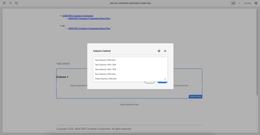
The authoring dialog for our column control component looks like the below with the aforementioned options available:
For the styling and implementation logic, we have used styled-components and TypeScript but anything else can be used as well. That is all up to the front-end implementation of the project. The main focus of this article is on how container components work in AEM SPA implementation.
Implementation
Sling Model
I have extended the aem-core-wcm-component container and used the Sling delegation pattern to reuse the existing core component logic in our column control component’s sling model.
The exact code line is here.
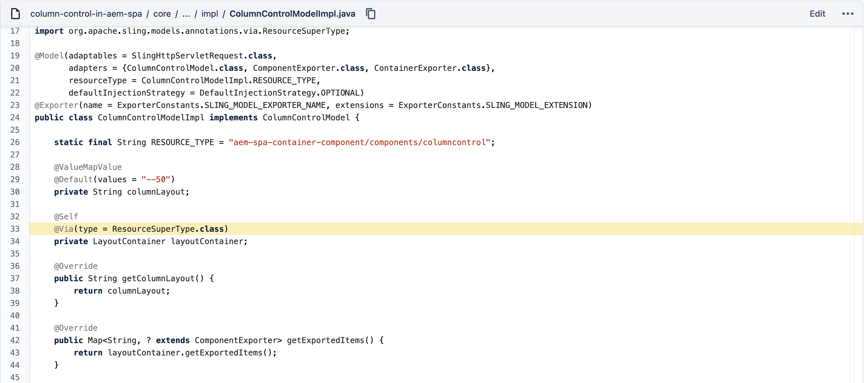
- As expected we have to follow all other container component practices like implementing the ContainerExporter API and adding ComponentExporter and ContainerExporter in the adapters property of the @Model annotation
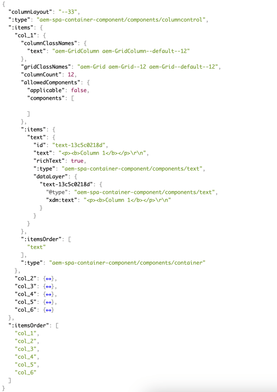
- Exported JSON of our column control component (http://localhost:4502/content/aem-spa-container-component/us/en/home/jcr:content/root/responsivegrid/columncontrol.model.tidy.json)
AEM Component Structure
The structure is similar to any other AEM component with the below additions:
- “cq:isContainer” property is set to true since this is a container
- “sling:resourceSuperType” is set to the project’s container component/core container component.
- “cq:template” has the node structure for the maximum number of allowed columns (i.e. Layout Containers). In our case, it is 6. The template stubbing is done so that all the required responsive grid nodes are available as soon as the component is added to the page/template, preventing editor issues.
React Component structure
- All logic is in the index.tsx.
- The “ColumnControlProps” interface defines the properties structure of our column control component.
- The “ColumnControlConfig” object defines the edit configurations.
- The “ColumnLayoutToNumOfColumnsMap” object defines the mapping between the authoring dialog options and the number of columns.
- “ColumnControl” is the react component representing our column control component.
- This will take care of the mapping and initialization of the child components of our component. Like this.childComponents will give all the children of our component that can further be used in our rendering logic.
- The most important part of creating a container component in the AEM React SPA is extending the “Container” abstract component from “@adobe/aem-react-editable-components” module.
- All other methods like “configuredColumns”, “renderFirstNColumns” are normal JS methods as per the rendering logic of our component.
Final Result
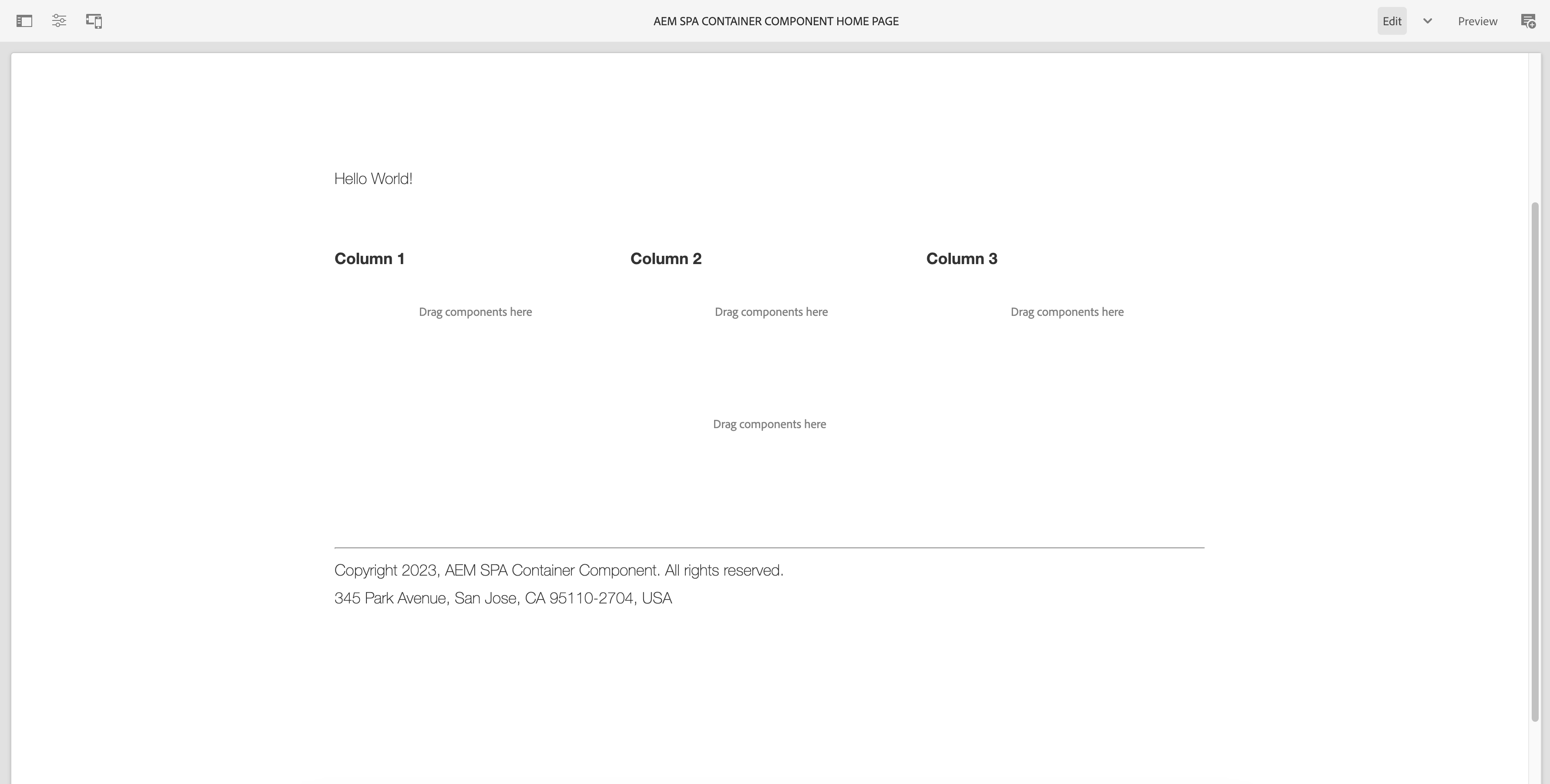
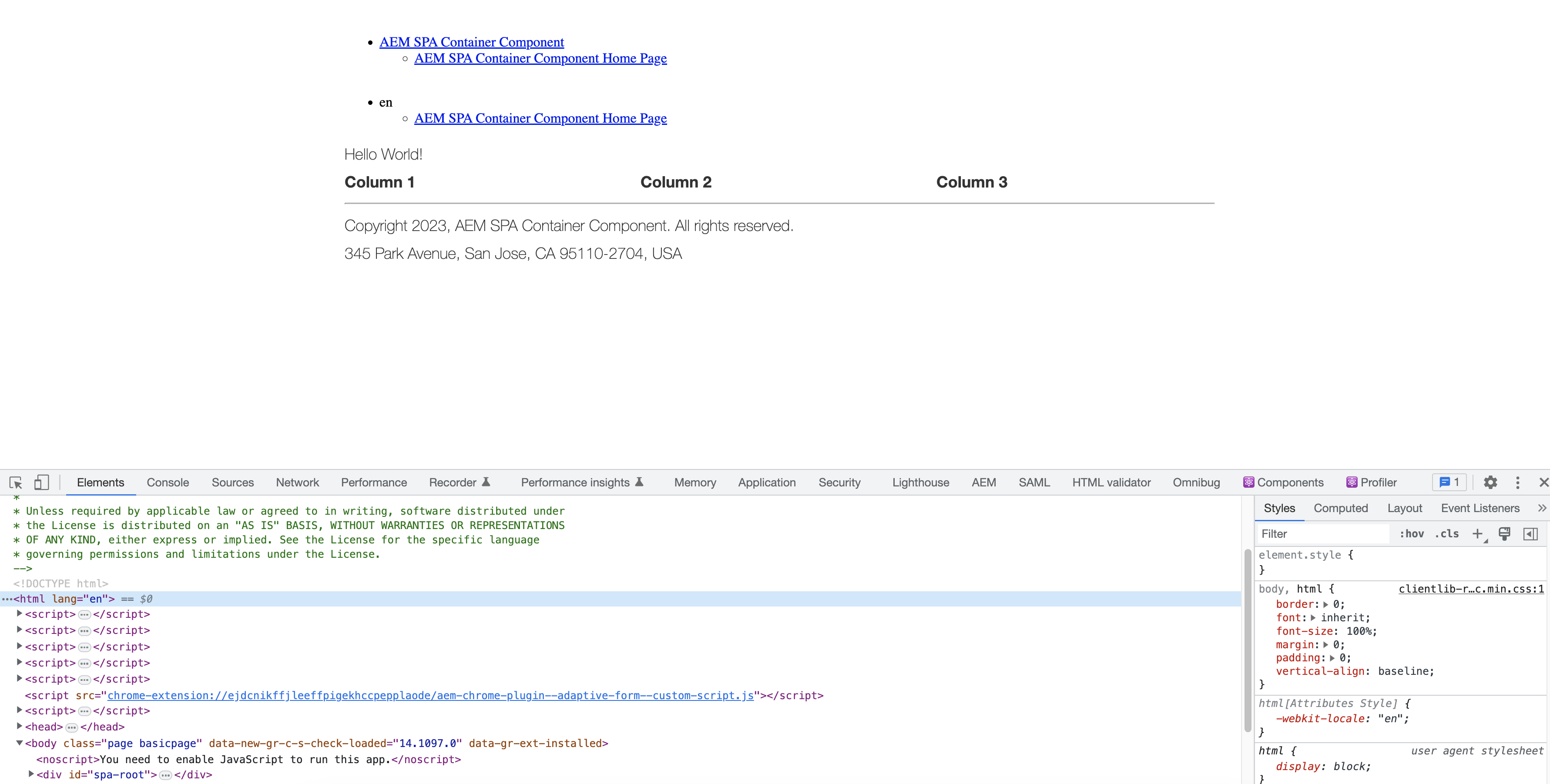
In Edit mode:
In Publish mode (Desktop):
In Publish mode (Mobile emulator):
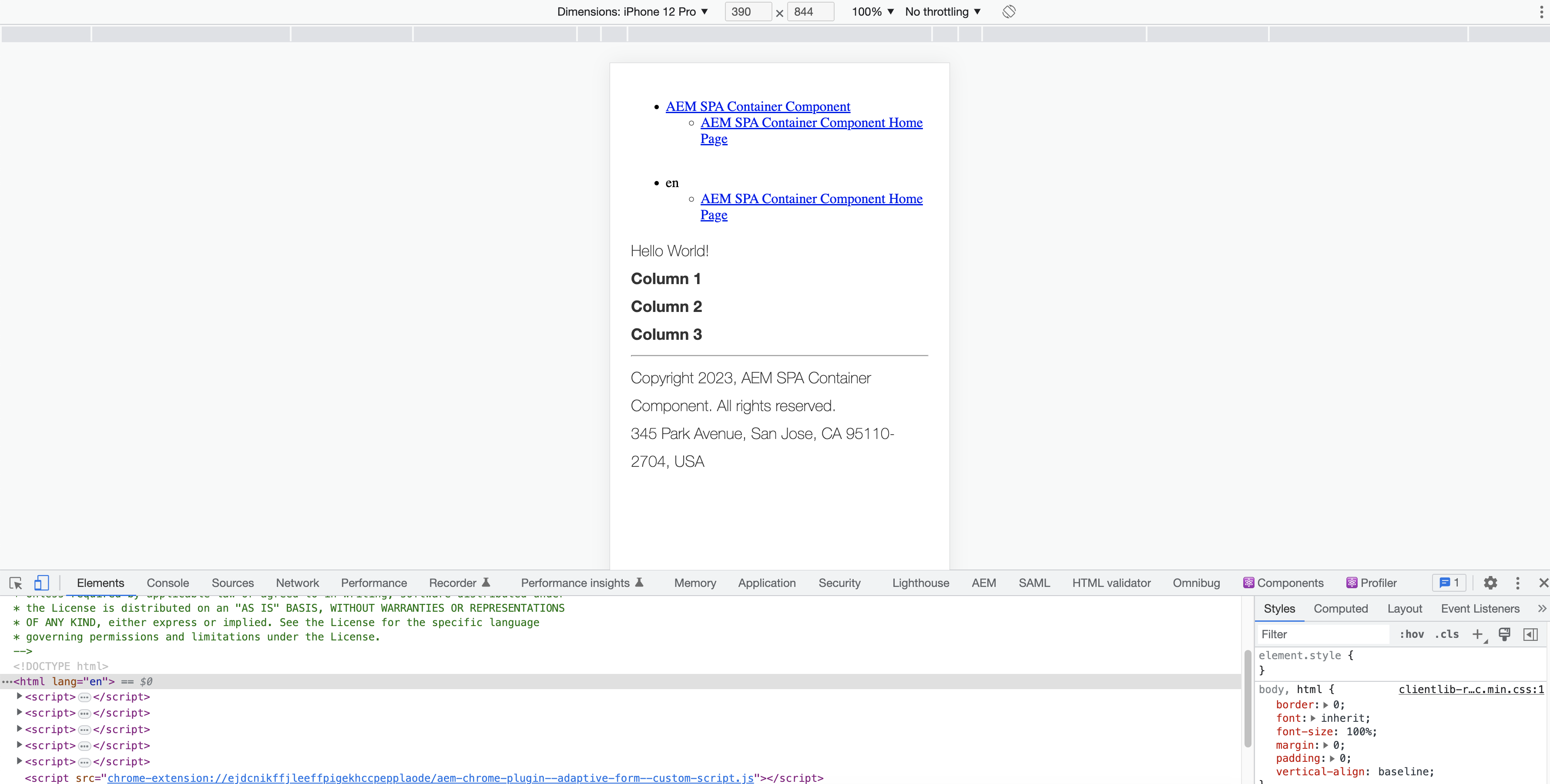
By creating this type of container component, you’ll empower authors to layout content in a more flexible way. The Column Control will become one of the more versatile and handy components at the authors’ disposal.
If you have a challenging AEM Sites use case or any other Adobe Experience Cloud or AWS questions, get in touch. The 3|SHARE team would love to help!
Topics: Adobe Experience Manager, Development, AEM, Adobe